
Font size options
Increase or decrease the font size for this website by clicking on the 'A's.


Contrast options
Choose a color combination to give the most comfortable
contrast.

Introductory text here. This should just be the plain old paragraph text. This is a good place for instructions, simplified policies, etc. For spacing purposes, it should be in a different content block than the title of the page and the subtitle.
For reasons that are inexplicable to me, you need to check your spacing (margins and padding) for every single content block you create. They are not always predictable. Unless otherwise specified, set padding to 10, margins to 0.
Colors, for reference: Web Gray (#59585a), Red (#a81e2f), Dark Blue Green (#0e6171), Navy (#173864), Yellow (#Fdba12)
This is where the real meat of your general explanation lives. It also serves as a spacer for your call to action box; the call to action box (at right) should be 4 grids wide. If possible, customize the action box to the page it lives on; what did people come to this page hoping to be able to do?

Though you can certainly make any size image fit, an image 300 x 200 pixels will play very nicely with Communico's grid system. The image at the left is center-justified in its own content box that is 4 grids wide.
There may be times that you want your image to wrap around your text; if this is the case, you are encouraged to reconsider your content. Image-wrapping occasionally does some weird spacing things when browsers are resized; having an image be center-justified helps images translate well to mobile.
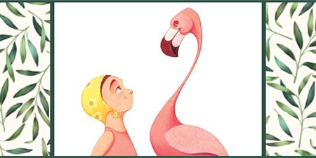
This is an example of a picture set in-line with text that will wrap around it. Honestly, it's not my favorite. I can't figure out how to increase the padding on just the image, but I know Brian could fix that. 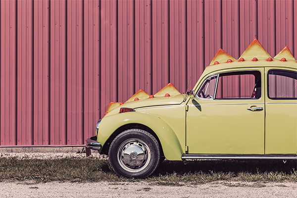
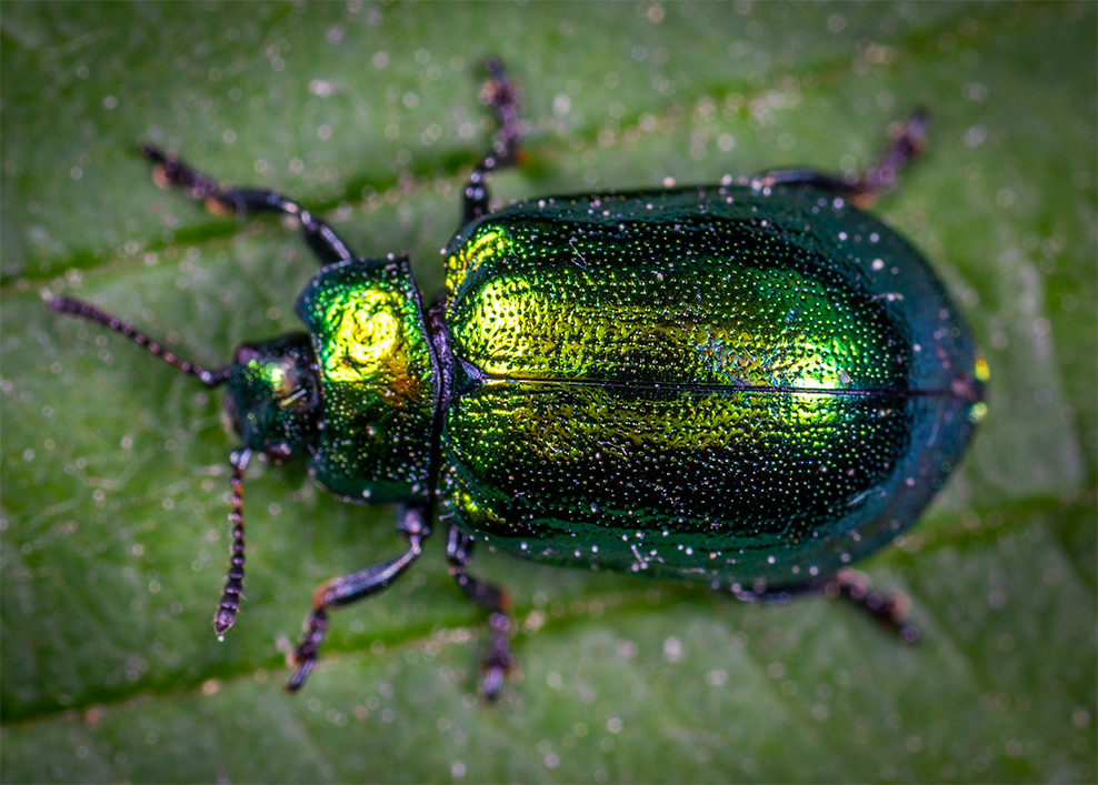
You may sometimes want a larger picture; larger pictures should be 600 x 400 pixels; for larger pictures, you are strongly encouraged to have each picture in its own content box.
Bear in mind that larger images mean longer loading times. Use sparingly.
Below you will find guidelines for creating content sectioned off with boxes.
Do as I say, not as I do: try to avoid having two lines of heading text. Text within a section should be left-justified, with headings centered on the box.
To include the border, click on block settings and add a border. The border should be Navy (#173864) at 3 wide.
Your content box width can vary depending on your needs. Bulleted lists should utilize square bullets
Spacing for content boxes:
It is acceptable to have content boxes of differing heights next to one another, though do your best to avoid a difference such as these three. Consider reconfiguring your layout or simplifying your content to make things look more streamlined.
Please use no more than 3 sections per row.
Some general guidelines: use your sections to convey the importance of information. Whole row-sections will get more attention than multiple items in a row.
Grouping items by row conveys similar theme, action, or interest level.
Having a section take up a full row conveys importance; it can also be a nice visual break. In all things, remember this: if you're worried that your page looks too busy, it does. Sectioned content should break information into digestible bits and should be easily scannable.
When designing a page, be sure to shrink your browser to preview your layout on mobile as well!
Sometimes, you will want content but not necessarily the boxes. Here are some image sizes to help distinguish content with images.

Please use no more than 3 sections per row.
For a row with 3 sections, use images that are 300 x 200 pixels.
Grouping items by row conveys a similar theme, action, or interest level.
You may find a container box useful in helping you achieve all your layout goals.
Please use no more than 3 sections per row.
For a row with 3 sections, use images that are 300 x 200 pixels.
Grouping items by row conveys a similar theme, action, or interest level.
You may find a container box useful in helping you achieve all your layout goals.
Please use no more than 3 sections per row.
For a row with 3 sections, use images that are 300 x 200 pixels.
Grouping items by row conveys similar theme, action, or interest level.
If you find that two sections per row suits your purposes, use images that are 450 x 255 pixels.
Center justify headings, left justify copy.
If you find that two sections per row suits your purposes, use images that are 450 x 255 pixels.
Center justify headings, left justify copy.
Please use no more than 3 sections per row.
Some general guidelines: use your sections to convey the importance of information. Whole row-sections will get more attention than multiple items in a row.
Grouping items by row conveys similar theme, action, or interest level.
Please use no more than 3 sections per row.
Some general guidelines: use your sections to convey the importance of information. Whole row-sections will get more attention than multiple items in a row.
Grouping items by row conveys similar theme, action, or interest level.
Please use no more than 3 sections per row.
Some general guidelines: use your sections to convey the importance of information. Whole row-sections will get more attention than multiple items in a row.
Grouping items by row conveys similar theme, action, or interest level.
Please use no more than 3 sections per row.
Some general guidelines: use your sections to convey the importance of information. Whole row-sections will get more attention than multiple items in a row.
Grouping items by row conveys similar theme, action, or interest level.
Please use no more than 3 sections per row.
Some general guidelines: use your sections to convey the importance of information. Whole row-sections will get more attention than multiple items in a row.
Grouping items by row conveys similar theme, action, or interest level.
Please use no more than 3 sections per row.
Some general guidelines: use your sections to convey the importance of information. Whole row-sections will get more attention than multiple items in a row.
Grouping items by row conveys similar theme, action, or interest level.
Please use no more than 3 sections per row.
Some general guidelines: use your sections to convey the importance of information. Whole row-sections will get more attention than multiple items in a row.
Grouping items by row conveys similar theme, action, or interest level.
Please use no more than 3 sections per row.
Some general guidelines: use your sections to convey the importance of information. Whole row-sections will get more attention than multiple items in a row.
Grouping items by row conveys similar theme, action, or interest level.

If you are experiencing issues accessing information on our website, or need further assistance, please contact information@provolibrary.org.

